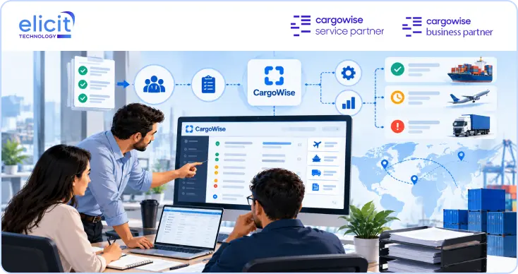
Elicit Technology helps logistics businesses extract the full value of CargoWise. We are not another ERP vendor — we are the implementation and consulting partner that makes the platform actually work for freight forwarders, customs brokers, warehouse operators and transport providers.
Brand Story
1.1
Global logistics runs on complex software. CargoWise is the most powerful platform in the industry — and also one of the most demanding. Most companies buy it, switch it on, and use a fraction of what it can do.
Elicit exists to close that gap. We combine deep technical expertise with genuine logistics domain knowledge, so implementations aren't just technically correct — they reflect how freight actually moves.
The name says it. To elicit is to draw out what is already there. We don't replace your systems or rewrite your processes. We surface the capability sitting dormant inside your platform and your people.
That belief shapes everything downstream — the calm confidence of the visual system, the precision of the typography, and the plain, direct way we write.
Mission
1.2
Our Mission
To help logistics companies unlock the full potential of CargoWise — through expert implementation, practical consulting, and technology that fits the way freight really moves.
Vision
1.3
Our Vision
A supply chain industry where no company is limited by its software — where every operator, broker and forwarder runs on systems that are fully configured, fully understood, and fully theirs.
Core Values
1.4
Five principles that govern how we work, what we ship, and how the brand behaves in the world.
Precision
In logistics, a small error compounds across every shipment. We configure carefully, document thoroughly, and check twice.
Domain Fluency
We speak freight before we speak software. Consignments, customs entries, cross-docks — the language of the work is our starting point.
Straight Answers
If something won't work, we say so early. No inflated scopes, no vague timelines, no discovery theatre.
Operational Empathy
We design around the person on the floor at 6am, not the slide in the boardroom. Adoption is the real deliverable.
Compounding Value
Every engagement should leave the client more capable without us. We transfer knowledge, not dependency.
The Through-line
Expertise that respects the operator. Every value above is a different expression of that one idea.
Brand Personality
1.5
Where Elicit sits on the spectrums that matter. Use these when judging a design, a headline, or a deck.
Playful
Precise
Loud
Considered
Abstract
Practical
Corporate
Human
Trend-led
Enduring
Generalist
Specialist
We are
Expert, calm, exact, quietly confident.
We are not
Salesy, jargon-heavy, hype-driven, vague.
If Elicit were
A senior operations engineer, not a keynote speaker.
Feels like
A control tower at night — clear, dark, in command.
02 — Logo Guidelines
The mark is the signature. Treat it that way.
The Elicit logo pairs a lowercase geometric wordmark with a rising gradient arc — a small gesture of momentum lifting off the final letterform. Reproduce it exactly; never rebuild or retype it.
Primary Logo
2.1
The full lockup — wordmark, arc and the TECHNOLOGY descriptor. This is the default in every context where space allows.
Primary · DarkOn #05070D — preferred
Primary · LightOn #FFFFFF — print & documents
Secondary & Mono Logos
2.2
Single-colour versions for constrained reproduction: brand-colour backgrounds, photography, embroidery, engraving, single-ink print and partner co-branding bars.
Reversed
Mono White
Mono Navy
Reversed
Solid white on gradient, blue or navy fields. Never on light backgrounds.
Mono White
Photography, video overlays, dark event collateral, apparel.
The et monogram — the e and t from the wordmark, the rising arc, and the gradient baseline. Use it only where the full lockup would be illegible: favicons, app tiles, social avatars, loading states and the profile mark.
Icon · Full Colour
App Tile
Avatar · Reversed
Favicon Sizes
32 · 20 · 16px
Proportions
Artboard 1668 × 1707. The gradient baseline is a fixed part of the mark — never crop or remove it.
Minimum size
16px in digital. Below that the arc closes up — use a solid blue tile with the e only.
Padding in tiles
Icon occupies 52–56% of a square tile. Optically centre it — the arc pulls weight to the upper right.
Clear Space
2.4
Minimum clear space equals X on all four sides, where X is the cap height of the lowercase e. Nothing enters this zone — no text, rules, images or page edges.
XXXX
Rules of thumb
01X = the height of the letter e in the wordmark (≈ 45% of total logo height).
02In dense UI, X may reduce to 0.5X — never below.
03Co-branding: separate partner marks by a minimum of 2X with a 1px divider at 12% white.
04More space is always better. When in doubt, add.
Minimum Size
2.5
Below these sizes the descriptor breaks up and the arc loses definition. Switch to the icon instead of shrinking the lockup further.
170px · Comfortable
✓ Recommended
104px · Digital minimum
✓ Allowed
80px · Print minimum (22mm)
✓ Print only
52px
✕ Use icon instead
Correct Usage
2.6
✓ Full-colour on dark
The default. Maximum contrast, gradient reads cleanly.
✓ Full-colour on white
Approved for print, documents and light partner templates.
✓ White on brand gradient
Use the reversed mono file — not the colour file with a filter.
Incorrect Usage
2.7
These break the mark. There are no exceptions, including "just this once for a client deck".
✕ Don't stretch
Always scale proportionally. Hold Shift.
✕ Don't recolour
No off-brand hues, tints or effects on the mark.
✕ Don't place on low contrast
Busy or mid-tone backgrounds kill legibility. Use mono.
✕ Don't rotate
The logo is always horizontal and level.
✕ Don't add effects
No drop shadows, bevels, glows, outlines or strokes.
Logistics Partners
✕ Don't add taglines
Never lock additional wording into the mark.
✕ Don't reduce opacity
Except as an intentional watermark at ≤6% in brand-owned layouts.
elicit
✕ Don't retype it
The wordmark is custom-spaced artwork, not live text.
03 — Color Palette
A disciplined palette. Blue does the talking.
The system is built on one decisive blue, one supporting violet, and a deep navy that anchors everything. Neutrals carry the layout; colour is reserved for meaning. Click any swatch to copy its hex value.
Primary Colors
3.1
Elicit Blue is the brand. It highlights the key phrase in a heading, drives every primary action, and appears in roughly one element per view — no more.
Click to copy
Elicit Blue
#1649EFPrimary
RGB 22 73 239 HSL 226° 87% 51% CMYK 91 69 0 6
Click to copy
Elicit Violet
#421DDDPrimary
RGB 66 29 221 HSL 252° 77% 49% CMYK 70 87 0 13
Click to copy
Signal Blue
#4285F4Logo
RGB 66 133 244 HSL 217° 89% 61% CMYK 73 45 0 4
Click to copy
Elicit Navy
#061B31Secondary
RGB 6 27 49 HSL 211° 78% 11% CMYK 88 45 0 81
Heading rule
Platinum Certified CargoWise Service & Business Partner
Hero headings put the leading phrase on its own line in Elicit Blue, with the remainder in Navy.
Section headings highlight one key phrase inline instead — as in "Proven Solutions" or "Why Choose". One highlight per heading, never a whole sentence.
Dark-mode adjustment
On white, #1649EF measures 6.49:1 — safe for all text. On the dark bands it drops to 3.11:1, which fails for body copy. So on dark, highlights switch to Signal Blue #4285F4 (5.68:1) while #1649EF stays for fills, buttons and accents.
6.49:1 · on white
3.11:1 · on dark ✕
5.68:1 · on dark ✓
Secondary & Neutrals
3.2
The system is light-first, matching the website. Two ramps exist: Light for the default canvas, and Dark for the deep blue feature bands. Both are cool-tinted toward navy so nothing ever reads as flat grey next to the blue.
Light ramp — default canvas
Click to copy
White
#FFFFFFPage, cards
Click to copy
Canvas Tint
#F4F6FAAlternating sections
Click to copy
Elevated
#EEF2F8Input fill, hover
Click to copy
Border
#E5EDF5Card borders, rules
Click to copy
Slate
#8493A6Meta labels
4.1:1 — large text & labels only
Click to copy
Muted
#6B7C91Captions, helper
5.2:1 on white
Click to copy
Body
#41556CBody copy
8.5:1 on white
Click to copy
Elicit Navy
#061B31Headings
16.6:1 on white
Dark ramp — feature bands & footer
Click to copy
True Black
#000000Band & hero panel base
Always with a blurred blue glow — never flat
Click to copy
Deep Surface
#0A1024Cards on dark
Click to copy
Mist
#B3C0D4Body on dark
11.4:1 on #04060F
Click to copy
Signal Blue
#4285F4Highlights on dark
5.7:1 on #04060F
Accent & Status Colors
3.3
Functional only. These communicate shipment states, validation and data series — they are never decorative and never appear in marketing layouts as brand colour.
Click to copy
Success
#16C784Cleared, delivered
Click to copy
Warning
#F5A524Pending, at risk
Click to copy
Danger
#F0475CException, held
Click to copy
Info
#17C8DBIn transit, notices
Delivered Awaiting Customs Exception DraftStatus colours always appear at 13% opacity fill with the solid hue as text.
Brand Gradient
3.4
Taken directly from the arc in the logo. Violet lifts into blue — a rising motion. Use it sparingly: one gradient element per screen, at most.
CTA Gradient · 90° #421DDD → #1649EF Buttons only · click to copy CSS
The 60 / 30 / 10 rule keeps layouts calm. Sixty percent neutral ground, thirty percent surface and structure, ten percent brand colour. This holds on both the light canvas and the dark feature bands.
60% · Neutral ground
30% · Surfaces
10% · Brand
60% · Deep navy ground
30% · Glass surfaces
10% · Brand
Do
Let one blue element own the screen — the primary button, the highlighted phrase, or the active chart series.
Do
Use opacity variants of brand colour (8–16%) for tinted surfaces instead of introducing new hues.
Don't
Never use blue and violet as equals in the same component — violet supports, blue leads.
04 — Typography
Two typefaces. Zero ambiguity.
Mona Sans sets the voice of every headline, number and interface label. Geist carries long-form reading. Nothing else is permitted — no fallback serif, no decorative display face, no exceptions for client decks.
Primary Font — Mona Sans
4.1
A variable grotesque with a wide weight range and tight, engineered spacing. Used for headings, UI labels, numerals, buttons and anything that needs presence.
Neutral, highly legible, engineered for screens. Geist carries body copy, documentation, form text and long-form marketing. It also handles all data, references and code — there is no separate monospace face in this system. Where columns need to align, Geist is set with tabular figures.
Four weights in production. Anything heavier than 600 is reserved for oversized display moments — 800 and 900 never appear below 40px.
Regular · 400
Full-value CargoWise delivery
Body
Medium · 500
Full-value CargoWise delivery
UI labels
Semibold · 600
Full-value CargoWise delivery
Headings
Bold · 700
Full-value CargoWise delivery
Emphasis
Extrabold · 800
Full-value CargoWise delivery
Display ≥40px
Heading Styles
4.4
Headings scale fluidly between mobile and desktop. Tracking tightens as size increases — this is what keeps large type feeling engineered rather than inflated.
Display
Mona Sans 600 72 / 44px · −4.5% line-height 1.02
Heading 1
Mona Sans 600 44 / 30px · −3.5% line-height 1.1
Heading 2
Mona Sans 600 30 / 26px · −3% line-height 1.15
Heading 3
Mona Sans 600 21 / 19px · −2% line-height 1.25
Heading 4
Mona Sans 600 16px · −1% line-height 1.35
Eyebrow / Overline
Geist 500 11px · +16% uppercase
Body Text Styles
4.5
Body — Large · 16.5/1.65
Elicit works alongside your operations team to configure CargoWise around the way you actually move freight — not the way a manual assumes you do.
Body — Default · 15/1.65
Every engagement begins with a workflow audit. We map the current state, identify the gaps between configuration and practice, and prioritise by operational impact rather than technical convenience.
Body — Small · 13.5/1.6
Used for card copy, table cells, helper text and dense supporting information where space is constrained.
Reading rules
01Measure: 62–78 characters. Never let body copy span a full 1080px container.
02Body text is always Mist #B6C0D0 on dark, Navy #061B31 on light — never pure white or pure black.
03Line height 1.6–1.7 for body, 1.02–1.25 for headings. No values in between.
04Minimum size 12px anywhere; 13.5px in any interface a user reads daily.
05Numerals in tables use Geist with font-variant-numeric: tabular-nums so columns align.
TABULAR EXAMPLE
SEA-4471 12,480 kg +14.2% AIR-0982 3,105 kg −2.6%
Typography Playground
4.6
Edit the text, switch typeface, weight and size. This is the fastest way to sanity-check a headline before it reaches a deck.
44px
−3.0%
Move freight, not paperwork.
Click the text to edit it directly.
05 — Visual Language
The parts that make it feel like Elicit.
Beyond logo and colour, consistency comes from the small decisions: how an icon is drawn, how sharp a corner is, how far apart two elements sit. These are the defaults.
Icon Style
5.1
Outlined, geometric, 24×24 grid, 1.6px stroke, round caps and joins. No fills, no duotone, no two-tone shading. Icons inherit text colour and shift to Signal Blue on interaction.
GRID
24×24 with a 2px safe margin. Optical alignment beats mathematical.
STROKE
1.6px at 24px. Scale the stroke with the icon — never leave it fixed.
RADIUS
2px inner corner radius. Sharp enough to feel technical, soft enough to feel modern.
Illustration Style
5.2
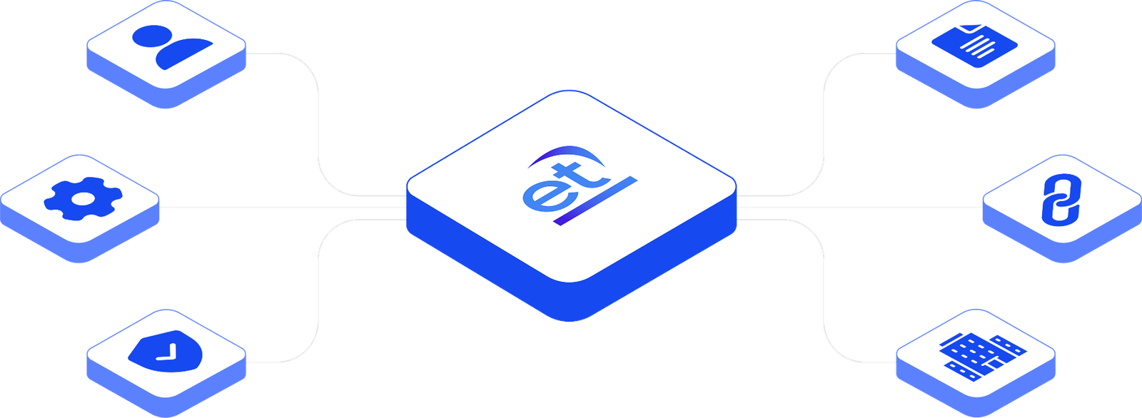
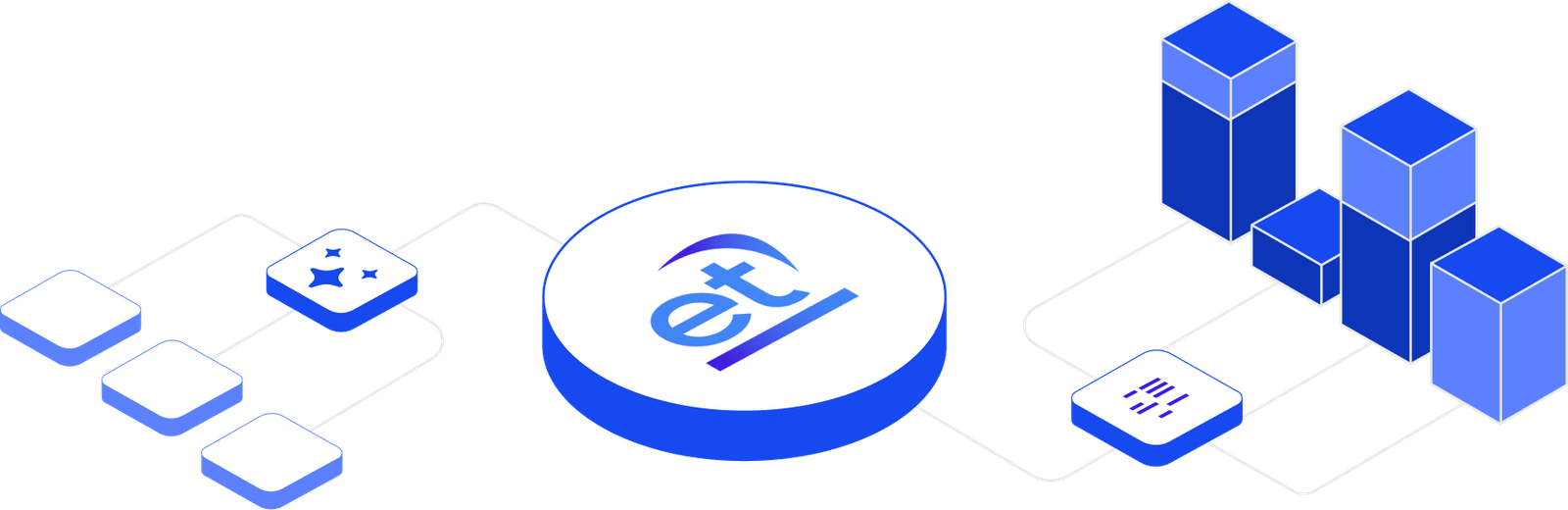
Elicit illustrations use an isometric 3-D language — brand blue fills, light stroke outlines, and the et monogram always at the centre. All compositions sit on a white or very light ground with no drop-shadow except the built-in isometric face shading.
Palette
Elicit Blue #1649EF and Violet #421DDD for solid fills. Signal Blue #4285F4 for lighter faces and icon strokes. No off-brand colours.
Perspective
Strict isometric projection — no two-point perspective. All tiles share the same 30° angle. Do not mix isometric and flat art in a single composition.
The et mark
Always placed on the central connecting tile. Never floating or off-centre. Use the full-colour version (gradient arc visible) — never mono or recoloured.
Hero — Platform Overview
Wide-format · white ground · for hero sections & decks
Isometric
Image missingCopy into images folder: https://elicittechnology.com/wp-content/themes/generatepress/assets/brand-guidelines/images/illus-hero.png
Integrations Diagram
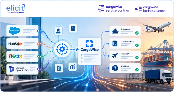
Accounting & ERP connectors · left → et → right layout
Connector
Image missingCopy into images folder: https://elicittechnology.com/wp-content/themes/generatepress/assets/brand-guidelines/images/illus-integrations.png
Services Hub
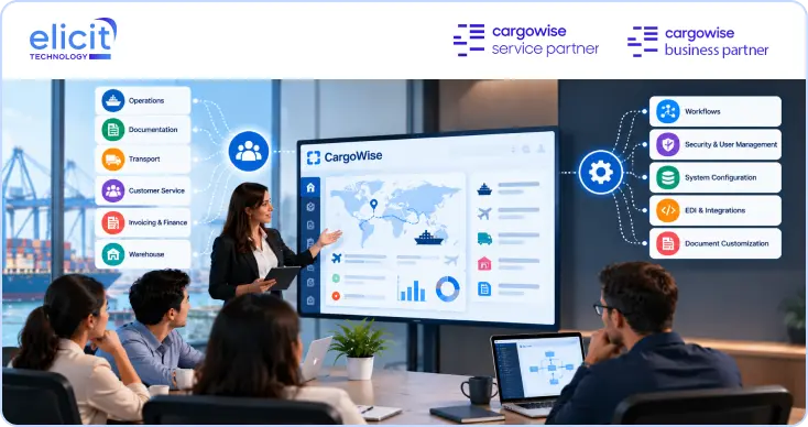
Feature tiles radiating from et — for capability overviews
Hub & Spoke
Image missingCopy into images folder: https://elicittechnology.com/wp-content/themes/generatepress/assets/brand-guidelines/images/illus-services.png
✓ Use for
Website hero sections and feature panels
Sales decks and proposal documents
LinkedIn posts and partner one-pagers
Email headers for campaign sends
✕ Don't
Recolour tiles — blue/violet only
Change the projection angle or flatten to 2-D
Remove or reposition the et monogram
Mix with photography in the same frame
Image Style
5.3
Photography is real, operational and unposed: ports at dusk, terminal yards, freight in motion, people at workstations. Every image receives a navy duotone treatment so it recedes behind the type.
Duotone Navy
Default treatment. Shadows to #05070D, highlights to #1E4E80.
Bottom Scrim
Required whenever text sits over an image.
Brand Wash
Hero images only. 40% gradient at screen blend.
Shapes
5.4
Every Elicit surface carries the same asymmetric corner: three tight corners and one open bottom-right. It reads as a shape that has been cut and released — a small forward gesture that echoes the rising arc in the logo. This is the single most recognisable non-logo element in the system.
The open corner is always bottom-right. Never rotate, mirror or move it to another corner — a flipped corner reads as a different brand.
THE RATIO
Open corner = 3.5 × the base corner. On the 39px CTA that is 3px → 10.5px.
SCALING
Base corner ≈ 7.5% of element height; open corner ≈ 27%. Recalculate — don't reuse fixed values at every size.
NESTING
A cut element inside a cut element repeats the shape at half scale — see the white arrow tile inside the CTA.
The Signature Arc
The arc from the logo doubles as a large-scale background graphic. Blown up far beyond its original size and dropped to low opacity, it gives a section brand character without introducing a second visual idea. This is the only decorative shape Elicit uses — and it is used sparingly. The hero is the exception: its left panel stays completely clean white so the headline carries the whole moment.
ON LIGHT
Elicit Blue at 15% opacity, scaled 8–20× and bled off at least two edges.
ON DARK
White at 10% opacity as a diagonal sheen across the panel.
SCALE
Minimum 8× the logo arc. If the whole shape fits inside the frame, it is too small.
OPACITY
15% blue on light · 10% white on dark. Never above 20% — it must sit behind, not compete.
RULE
One arc per screen. Never behind body copy or tables. Never in brand colour at full opacity.
Split Hero Pattern
5.5
The Elicit hero is a hard vertical split at roughly 51 / 49 — clean white content on the left, a saturated blue panel on the right carrying the proof points. No rounded container, no gap, no shadow: the two halves meet on a straight edge running the full height.
We are your
Platinum Certified CargoWise Service & Business Partner
Getting the most out of CargoWise, whether you're just starting or already live. From first implementation to optimising your existing setup, Elicit helps logistics companies unlock the full power of CargoWise at every stage.
cargowise service partner
platinum accounting
platinum workflow
certified forwarding
certified customs
certified global rollouts
certified integration
certified warehouse
SPLIT
730 / 710 @ 1440
HERO HEIGHT
533px below the 96px header
PANEL FILL
radial from #2E5FFF at 24%/70% → #050A20 at the corners
SHEEN
white 11% → 0%, 128° from the top-right corner
The headline rule
The hero headline is two-tone: the leading phrase sits on its own line in Elicit Blue, and the remainder follows in Navy. The blue line is the claim; the navy lines are the detail. Never highlight a word in the middle of a hero headline — that is a body-copy pattern, not a hero pattern.
We are your
Eyebrow pill
28px tall · fully rounded · white fill · 0.75px #D1D1D1 hairline · Geist 13px #061B31 · leading marker is a 6.21px solid blue square, never a circle or dot.
Below 900px the split stacks — content first, black panel second, full-bleed.
Border Radius
5.6
All radii are written in the TL TR BR BL order so the open corner is always explicit. Nothing in the system uses a uniform radius.
3·3·6·3 Chips, inputs, tiles
3·3·10.5·3 Buttons & CTAs
6·6·24·6 Cards, panels
8·8·40·8 Hero & feature blocks
Full Eyebrow pills, avatars, status only
Do
Keep the open corner bottom-right on every element in a layout, so the whole page shares one direction. Step nested elements down one level — a 6·6·24·6 card holds 3·3·10.5·3 buttons.
Don't
Never use a uniform radius on a branded surface — it erases the signature instantly. Never mirror the cut for a right-aligned element, and never apply it to avatars, status pills or the logo container.
On dark surfaces, elevation is communicated primarily through border luminosity and background lift — shadow is a secondary cue, always soft and never black-heavy.
Level 0 flat
Level 1 subtle
Level 2 raised
Level 3 floating
Focus brand glow
Spacing System
5.8
A strict 4px base. Every margin, padding and gap in the system is a multiple of 4 — no arbitrary values, ever.
4 · space-1
8 · space-2
12 · space-3
16 · space-4
24 · space-6
32 · space-8
48 · space-12
64 · space-16
96 · space-24
128 · space-32
SECTION RHYTHM
96px between sections · 48–60px between subsections · 16px between cards.
Logistics interfaces carry more information per screen than almost any other software category. These components are tuned for that reality: compact, high-contrast, and legible at a glance across a twelve-hour shift.
Buttons
6.1
The gradient CTA with its white arrow tile is the brand's primary action — it appears once per view, never twice. Everything else is secondary, ghost or destructive.
PRIMARY CTA — THE SIGNATURE BUTTON
SIZE
39px tall Large: 48px
RADIUS
3 · 3 · 10.5 · 3 Tile: 3 · 3 · 6 · 3
FILL
90° gradient #421DDD → #1649EF
ARROW TILE
30 × 30 · #FFFFFF Arrow #151515 · 1.125
PADDING
14px left 4.5px right inset
GAP
14px label → tile
TYPE
Geist 500 · 13px #FFFFFF
HOVER
−1px lift tile +2px right
The arrow tile is always white with a near-black arrow — never tinted, never inverted, never removed. It is what makes the button recognisably Elicit rather than a generic gradient pill.
SUPPORTING VARIANTS
SIZES
RADIUS
3 · 3 · 10.5 · 3
PADDING
10px 18px
TYPE
Geist 500 · 13.5px
TRANSITION
240ms · ease-out
Input Fields
6.2
As registered with customs authorities.
Filled state · Geist with tabular figures for reference codes.
✕ Enter a valid business email address.
Enable automated customs validation
Send me the implementation checklist
Subscribe to the quarterly briefing
Cards
6.3
Cards use a 1px border at 7% white plus a subtle top-down surface gradient. Hover lifts the border, never the shadow alone. Expandable cards reveal detail without leaving the page.
Standard
Implementation Audit
A four-week review of your current CargoWise configuration against operational reality.
Featured
Managed Optimisation
Ongoing configuration, workflow tuning and support retained across your operation.
Metric
Live
99.4%
Customs declarations accepted first-pass
Expandable — What a CargoWise audit actually covers
We review workflow configuration, document templates, EDI and customs integrations, rate and tariff structures, user permissions, and the gap between documented process and floor practice. The output is a prioritised remediation plan scored by operational impact and implementation effort — not a 90-page report nobody reads.
Expandable — How we handle data migration
Migration runs in three passes: a structural mapping exercise, a dry-run load into a sandbox environment with full reconciliation, and a cutover window with rollback. Historical shipment data is validated line-by-line against source records before go-live sign-off.
Tables
6.4
Table density is the single most important decision in an operational interface. Rows are 44px, headers are uppercase Mona Sans at 11px, and numerics are always mono and right-aligned.
Reference
Consignee
Mode
Status
Weight
ETA
HAWB-4471-892
Nordvik Logistics AS
Air
Delivered
3,105 kg
—
MBL-SEA-20881
Han Pacific Trading
Sea FCL
At Customs
12,480 kg
12 Aug
RD-EU-77120
Meridian Foods Ltd
Road
Exception
8,940 kg
09 Aug
MBL-SEA-20904
Kestrel Components
Sea LCL
Draft
1,272 kg
—
Dashboard Widgets
6.5
Metric first, context second, trend third. The number is always Mona Sans 600 at 31px with −3.5% tracking.
Active Shipments
1,284
▲ 8.2% vs last month
First-Pass Clearance
99.4%
▲ 1.6pt vs Q1
Avg. Dwell Time
2.1d
▼ 0.4d improvement
Open Exceptions
7
3 awaiting customs · 4 documentation
Charts & Data Visualisation
6.6
Charts use the brand gradient for a single primary series. Multi-series charts step through Signal Blue, Violet, Info and Slate — never through the status colours, which carry fixed meaning.
Shipment Volume by Month
Consignments processed · 2026 YTD
JAN
FEB
MAR
APR
MAY
JUN
JUL
AUG
Total consignments
Mode Split
Share of total volume
Sea Freight46%
Air Freight28%
Road17%
Rail & Other9%
Forms
6.7
Single column, labels above fields, 20px between fields, validation inline on blur. Multi-step forms show progress; never more than seven fields per step.
STEP 2/3
Tell us about your operation
Two minutes. We use this to scope the right level of engagement.
Navigation Components
6.8
SITE HEADER — 96px, white, 1px #E5EDF5 bottom rule
01Minimum touch target 44 × 44px, including icon-only buttons.
02Body text never below 13.5px; data references may drop to 11px.
03Gutters reduce to 16–22px; card radius steps down one level.
04Primary action is full-width and pinned to the bottom of the viewport.
05Tables become stacked cards below 720px — never horizontal scroll for critical data.
06The signature cut stays bottom-right at every breakpoint.
Presentation
7.3
CARGOWISE OPTIMISATION
Where the value is actually hiding.
A configuration review across 120 implementations.
01
FINDINGS
62%
of modules never configured
3.4×
manual rekeying vs benchmark
Most operations are running a fraction of what they've already paid for.
04
Deck rules — 16:9 · one idea per slide · maximum 24 words of body copy · logo top-left on section openers only.
Social Media
7.4
Approved social artwork. Every Elicit post is 1080 × 1350 with a white partner bar at the top, a bright blue field, a centred headline and a translucent contact bar bleeding off the bottom edge. The blue is lighter than the website hero — social has to survive feed compression and small thumbnails.
Always pull assets from here rather than copying them out of a deck or screenshotting the site. If a file you need is missing, request it from the design team instead of recreating it.
Logo Assets
8.1
SVG
Primary Logo — Full Colour
elicit-logo.svg · vector
↗
SVG
Logo — Mono White
elicit-logo-white.svg · vector
↗
SVG
Logo — Mono Navy
elicit-logo-navy.svg · vector
↗
SVG
Icon Mark — Full Colour
elicit-icon.svg · vector
↗
SVG
Icon Mark — Mono White
elicit-icon-white.svg · vector
↗
SVG
Icon Mark — Mono Navy
elicit-icon-navy.svg · vector
↗
Fonts
8.2
Two typefaces only. Both are open source under the SIL Open Font License — free to install locally and to embed in products and client deliverables. There is no third face and no monospace face; data styling is achieved with Geist's tabular figures.
elicit-tokens.json · for Figma Tokens / Style Dictionary
↗
TXT
Colour Palette Reference
elicit-palette.txt · every hex with usage notes
↗
Need something that isn't here?
Email the design team rather than improvising. Recreated logos, off-palette colours and substituted fonts are the three fastest ways to erode a brand — and all three are avoidable.